

A flexible content card.
+ Education · August 2026
Responsive Web Design in 2026: A Guide to Measurements, Dimensions, and Breakpoints for Desktop, Tablet, and Mobile
A Practical Guide to Measurements and Dimensions for Responsive Web Design: Desktop, Tablet, Mobile, Breakpoints, Containers, Figma, UX/UI, Above the Fold, and Browsers.
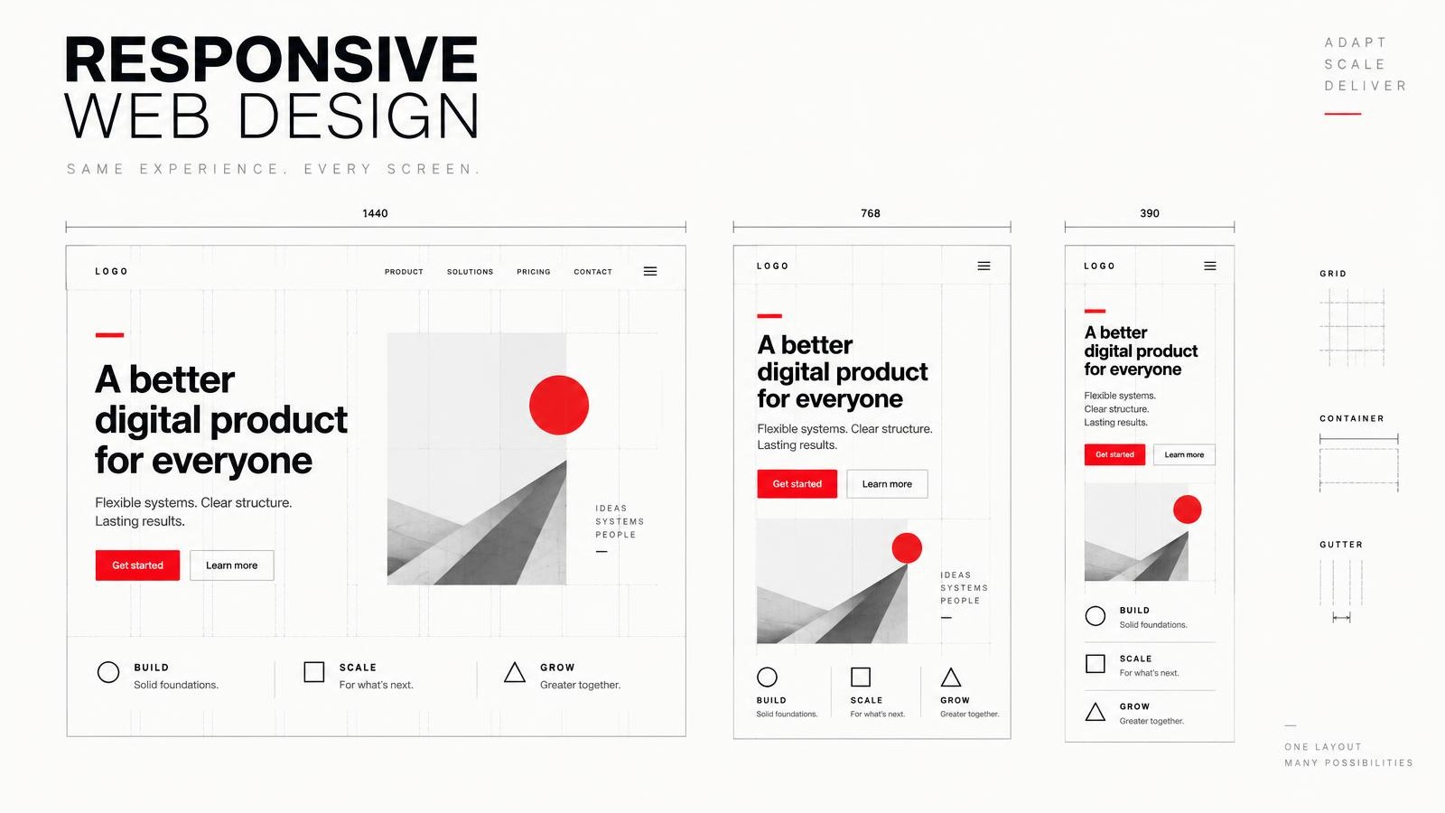
Practical Guide 2026
"Responsive" doesn't mean designing three screenshots
A responsive website isn't just a desktop version, a tablet version, and a mobile version strung together. It's a single system capable of reorganizing navigation, content, images, typography, and actions based on the available space.
That is why this guide does not propose one-size-fits-all solutions. It uses practical widths to help you get started with design and QA, but the final behavior should be determined by the content: a menu changes when it no longer fits; a grid changes when its cards are compressed; a line of text is truncated when it can no longer be read comfortably.
Quick answer: Start with 1440 px for desktop, 768 or 1024 px for tablet, and 390 px for mobile. Then try 320, 360, 430, 1280, and 1920 px, as well as all the values in between.
Last technical review: September 2026
+
Practical Steps for Responsive Design
The figures in this table are useful reference points for design and testing. They do not represent official standards, nor do they replace ongoing testing between one width and another.
Practical Steps for Responsive Design
Small mobile360 pxAdditional test: 320 px
Main Mobile390 pxTest: 360 / 375 / 430
Large mobile430 px
Tablet (portrait orientation)768 px
Tablet / Intermediate1024 px
Small desktop1280 px
Main Desktop1440 px
Wide desktop1920 px
These are guidelines for design and QA. They are not universal breakpoints.
+
Viewport, container, and reading width are not the same thing
The viewport is the available space in the browser, typically expressed in CSS pixels. The content container limits how far the layout can extend within that viewport. The reading width further limits the text column so that reading doesn't become a matter of scrolling across the screen from side to side.
In a 1440-px viewport, for example, a container of around 1200 px can accommodate navigation, images, and grids; within it, an editorial column of approximately 640–760 px provides ample space for paragraphs. These are design guidelines, not universal requirements.
A CSS pixel is a browser-defined unit of measurement; it is not necessarily a physical pixel on the screen. A high-density phone may use multiple physical pixels to represent a single CSS pixel. We design the layout in CSS pixels and serve images with sufficient resolution to maintain sharpness.
Viewport ≠ container ≠ reading width
Viewport · 1440 px
Content container · approx. 1200 px
Editorial text column
640–760 pxA wide viewport does not require the content or the reading pane to span its entire width.
+
Responsive design takes place between breakpoints
Presets help us review familiar scenarios, but an interface exists on a continuum. It also has to work at 412, 834, 1180, or any other width that falls between our reference points.
A breakpoint is the point at which the content needs to be rearranged. It shouldn't exist simply because a list defined "tablet" as 768 px. First, we reduce the space, observe where the layout loses clarity, and then make the change.
Responsive Continuum
MobileTablet / intermediateDesktop
3203603904307681024128014401920
Responsive design also applies between breakpoints.
+
Responsive Lab: Test the behavior, not a screenshot
Adjust the width, change the height, and enable the layers. The mockup page is built using real HTML and CSS: its navigation, hero section, and cards change depending on the simulated space.
Main Tool +
RESPONSIVE LAB
Change the width and height to check the layout and see exactly where the fold falls.
Active Viewport
mobile · CSS px
Full-page view520 px visible below the fold ↓
A better digital experience.
Flexible systems. Clear structure. Real-world behavior across every screen.
GET STARTED +A flexible content card.
A flexible content card.
Next section
Content continues beyond the first screen.
The lightly shaded area represents the first viewport. The red line indicates the exact fold line.
Test 568, 667, and 844 px with the same width to see how much content changes without altering the layout.
+
"Above the fold" changes depending on the context
"Above the fold" refers to what is visible before scrolling, but it does not correspond to a fixed height. It varies depending on the width and height of the viewport, the browser's dynamic toolbars, zoom level, typography, operating system, and device.
We don't have to put everything at the top. It's a good idea to make the main point clear, provide enough context, include a call to action, and indicate that there's more content below.
On mobile devices, `100vh` may behave unexpectedly when the browser interface appears or disappears. The units `svh`, `lvh`, and `dvh` allow you to distinguish between small, large, and dynamic viewports, although you should always test the results on actual devices.
Folding is a variable position
Desktop · 1440 × 900
HEADER
HERO
FOLD LINE
NEXT SECTION ↓
Mobile · 390 × 844
HEADER
HERO
FOLD LINE
NEXT SECTION ↓
We don't have to put everything at the top. We do need a proposal, context, action, and an indication that there's content below.
+
"Mobile first" is a priority, not a device name
Starting with a single column forces you to prioritize. When there is enough space, the system can incorporate two or three columns without losing its order. The transition is driven by the needs of the content, not by a commercial label for a phone or tablet.
WCAG 2.2 requires that content be able to reflow to a width equivalent to 320 CSS px without losing information or functionality and without requiring two-dimensional scrolling, except in cases where two dimensions are essential. This test also reveals headings that are cut off, controls that overlap, and floating elements that cover content.
Mobile first: a growing priority
Mobile
1 column
Tablet
2 columns
Desktop
3 columns
Columns change when the content needs space, not because a device has a specific name.
+
The content tells you where a breakpoint is needed
Three cards display properly at 820 px and begin to compress at around 720 px. That point—not the device name—is the reason to switch from three columns to two or one.
Media queries respond to the viewport. Container queries allow a component to respond to the width of its own container, which is especially useful when the same card is placed in a main column, a sidebar, or a reusable module.
The content hits the breakpoint
Three columns
Breakpoint in the example: 680 px
ContentsActionDetails
820 px Thethree columns have enough space.
720 px Spacebegins to contract.
Less than 680 px: The content switches to a single column.
This example switches to a single column at 680 px because that's where its three modules stop fitting properly; not because 680 px is a universal measurement.
+
Spacious containers, compact reading columns
A website can use a wide container for navigation, galleries, and card layouts without forcing its paragraphs to span that width. Limiting the editorial column improves the flow, reduces the visual journey, and makes it easier to find the next line.
Typography can also respond flexibly. `clamp()` defines a minimum, a flexible value, and a maximum, preventing unnecessary line breaks. Even so, each extreme must be tested to ensure that long words and headlines do not overflow their space.
Website container and reading column
Too wide
Readable
The layout can be spacious as long as the editorial column remains a readable size.
+
Getting Started with Figma: Design Behavior
A practical starting point is to create frames of 1440 for desktop, 768 or 1024 for tablet, and 390 for mobile, and also test 360 and 430. These frames are not standalone deliverables: they document how the same system responds.
Auto Layout helps organize positioning, spacing, and alignment. Fill Container fills the available space; Hug Contents preserves the size required by the content; Constraints maintain relationships within a frame; Min Width, Max Width, and Wrap help define boundaries and rearrangement.
The goal isn't to create perfect screenshots. It's to communicate which elements expand, which are restricted, when they wrap, which change order, and which should never be cut off.
Adobe XD was a great tool—just as FrontPage was in its day—and it remains useful for legacy projects. Adobe keeps it in maintenance mode, so anyone starting out today should be aware that it no longer receives active development of new features.
Frameworks for studying the same system
Desktop · 1440
Tablet · 1024
Tablet · 768
Mobile · 390
Frames document behavior. Auto Layout, Fill, Hug, Constraints, Min/Max Width, and Wrap specify what can change.
Check out the official Auto Layout guide and the Adobe XD reference.
+
Modern CSS for Simple Decisions
There's no need to turn every responsive design decision into an endless list of breakpoints. A container with a maximum width, fluid images, and typography with constraints can handle a large part of the system before you even need to add specific rules.
Container
.page-container {
  width: min(100% - 2rem, 1200px);
  margin-inline: auto;
}
Image
img {
  max-width: 100%;
  height: auto;
}
Typography
h1 {
  font-size: clamp(2rem, 5vw, 4.5rem);
}
Media query
@media (width >= 48rem) {
  .cards { grid-template-columns: repeat(2, 1fr); }
}
Container query
.module { container-type: inline-size; }
@container (width >= 36rem) {
  .card { grid-template-columns: 1fr 1fr; }
}
+
Responsive images are also part of art direction
An image with `max-width: 100%` prevents basic overflow, but a comprehensive system can use `srcset`, `sizes`, and `picture` to deliver appropriate resolutions or cropping. The goal isn't just to download less data—it's to preserve important information when the aspect ratio changes.
A portrait that works on a desktop may need to be cropped differently on a mobile device. If the subject, product, or text is part of the message, responsive images should be considered during production, not after publication.
In our web development and UX/UI services, these decisions are tied to strategy, content, performance, and real-world goals.
+
Test on real browsers and devices
Chrome, Safari, Firefox, and Edge may differ in how they render typography, form controls, video, sticky positioning, and height units. The dynamic UI in Safari and mobile Chrome also changes the visible viewport as we scroll.
Development tools speed up QA, but they are no substitute for a real iPhone and Android device. Touch, keyboard, zoom, browser bars, screen density, and performance can reveal issues that a simulation does not show.
Interaction targets need sufficient space. WCAG 2.2 specifies a minimum size of 24 × 24 CSS px for Level AA compliance, with exceptions; designing more user-friendly controls when the context allows it improves the touch experience.
Chrome
Safari
Firefox
Edge
Real iPhone
Real Android
A clear digital strategy helps prioritize which experiences, browsers, and user journeys need the most attention.
Quick Test
Review your website using specific criteria.
Self-audit +
DOES YOUR WEBSITE PASS THE RESPONSIVE TEST?
Result · 0 of 16
THERE IS ROOM FOR IMPROVEMENT
This tool is a quick reference and is not a substitute for a comprehensive UX/UI, accessibility, or front-end audit.
Frequently Asked Questions
Quick Answers About Responsive Design
What size should I use when designing a desktop website?
1440 px is an excellent practical starting point, but it is not a mandatory standard. Content is typically limited using `max-width`, and the system must work at other sizes as well.
What size should I use for mobile?
390 px is an excellent starting point. You should also try 360 and 430 px and ensure reflow at 320 CSS px.
What size should I use for a tablet?
768 and 1024 px are very useful guidelines, but the actual breakpoint should be based on the content, not the device name.
What should be the maximum width of a website?
There is no universal standard. For many corporate websites, a container of approximately 1080–1280 px works well as a starting point, while backgrounds can extend across the full width.
What is a breakpoint?
This is the point at which the layout needs to change because the available space no longer allows the content to be displayed properly.
What does "above the fold" mean?
This is the content that is visible before scrolling. Its position changes depending on the viewport, browser tabs, zoom level, and device; it does not correspond to a fixed measurement.
Should I design separate versions for desktop, tablet, and mobile?
We need to analyze all three contexts, but design them as variations of the same responsive system, not as three separate websites.
Sources
Official documents consulted
Tags
Topics in this article.
Let's talk
Does your website display clearly on every screen?
We design and develop responsive experiences with a focus on UX/UI, mobile, browsers, performance, and how people actually behave.
REQUEST A PROPOSAL +Conversation +
Comments.
0 published
Your input helps this conversation grow. Share your comments, questions, or experiences related to this article—we're here to listen.
Be the first to comment.
Continue reading
More from the blog.
Education · May 2025
Websites and the Importance of UX, UI, and Programming
Whether it's a website, microsite, or landing page, web design, UX, UI, and programming are key to making your website connect with visitors and drive sales. Here, we explain what all of this entails and why it's important.
Read the article +Services · March 2026
Beyond the website: we develop custom digital platforms and solutions
We develop custom platforms, APIs, databases, dashboards, and integrations that connect websites, CRMs, POS systems, and other systems to address real business needs.
Read the article +Education · March 2026
Designing for Context: Dimensions, Formats, and Creativity in Digital Advertising
Dimensions are just the beginning. Discover how to tailor design, creativity, and digital advertising to each platform, format, device, and audience.
Read the article +Education · July 2026
SEO + AI: How to Prepare Your Brand for the New Era of Search
The way we search is changing. Find out how to optimize your website, content, and brand for Google and the new search experiences powered by artificial intelligence.
Read the article +

+ Ideas That Keep Moving Forward
Get the next article.
Creativity, marketing, digital advertising, technology, and artificial intelligence—delivered straight to your inbox.
Let's get to work